Fields, Buttons & Filters
The building blocks of record-centric interface pages: field elements, field groups, action buttons, and user-facing filters.
Form, record review, and record detail pages are composed from a shared set of elements: fields, field groups, buttons, and user filters. Select any element on the canvas to configure it in the properties panel.
Field elements
A field element displays a single field of the connected table.
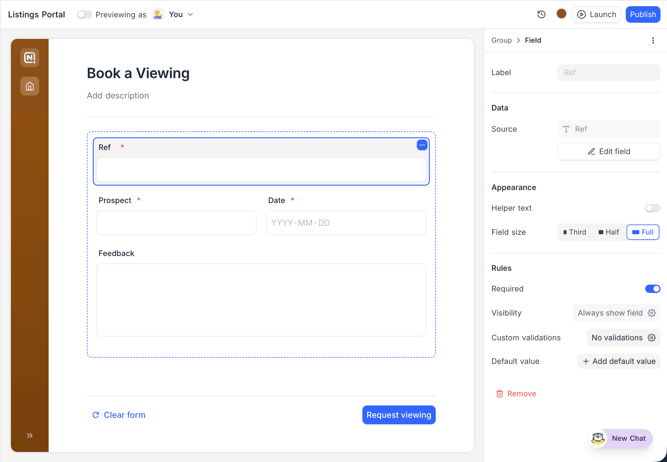
| Option | Description |
|---|---|
| Label | Override the field's label, or hide it entirely. |
| Helper text | Guidance shown with the field. |
| Permissions | View-only or editable. Editable fields can also allow inline editing directly on the page. |
| Rules | Required, default value, character limit, validators, and conditional visibility. |
| Select options | For select fields: limit which options are offered, and optionally allow users to add new options. |
| Appearance | Input size (default, large, extra large), style variants (for example a select shown as a field, list, or stepper), and width (third, half, or full row). |
| Show as | For link fields on record detail and record review pages: show linked records inline as pills or cards, or as an embedded view. See Linked records. |
Field groups and rows
Fields can be organised into groups, each with an optional title, description, and background colour, and arranged side by side in rows. Groups also control:
- Field labels position: beside or above the field.
- User actions: whether inline editing is allowed within the group.
- Conditional visibility: show or hide the whole group based on record values.
Drag fields, rows, and groups to rearrange them.
Buttons
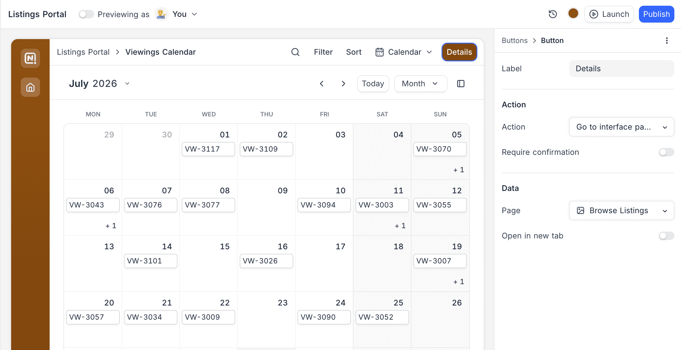
Buttons let users take actions from a page. They can sit in a table page's header, above a record review list, in a dashboard group's header, beside the title of the record sheet that opens from any page (Page › Record › User actions › Buttons) or of the record pane on a record review page, and on a field group inside a record sheet. Each button has a label, a colour, and one of the following actions:
| Action | Description |
|---|---|
| Go to external URL | Open an external link. |
| Go to interface page | Navigate to a page in this or any other interface of the base. |
| Open record creation form | Open a form to create a new record. |
| Update record | Set field values on the current record, for example an "Approve" button that sets Status to Approved. Optionally move to the next record after the update, and change the button's colour and label once applied. |
| Copy link to record | Copy a link to the current record. |
| Delete record | Delete the current record. Confirmation is on by default, and the toast offers Undo. |
| Go to URL in record | Open the URL stored in one of the record's URL fields. |
| Run automation | Run a workflow through the When a button is clicked trigger. On a record sheet, record pane, or field group the open record is passed as input; on a page header, list toolbar, or dashboard group the workflow runs without a record. |
Record-scoped actions (Update record, Copy link to record, Delete record, Go to URL in record) are available wherever a record is open: the record sheet, the record pane of a record review page, and field groups. Page-level placements offer Open record creation form, Go to interface page, Go to external URL, and Run automation. On record placements the first button renders inline and the rest fold into a ⋯ menu, and Rules › Visibility can show or hide a button based on the open record's values.
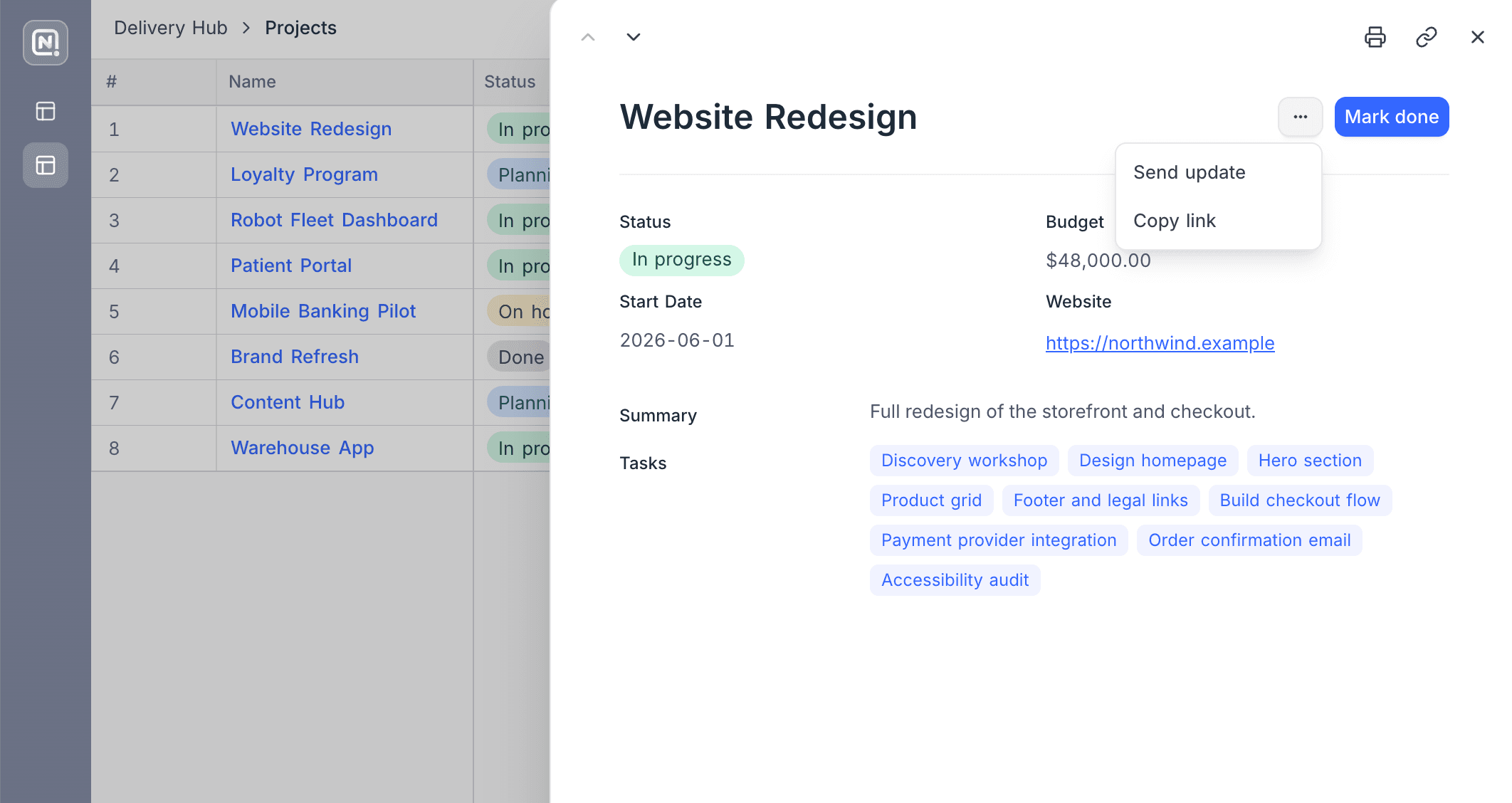
Visibility rules are available on NocoDB Cloud (Business plan and above) and licensed self-hosted deployments.
For consequential actions, enable Require confirmation to show a confirmation dialog with a custom title and message before the action runs.
User filters
User filters are end-user-facing controls that narrow the records shown on a page. They come in two forms:
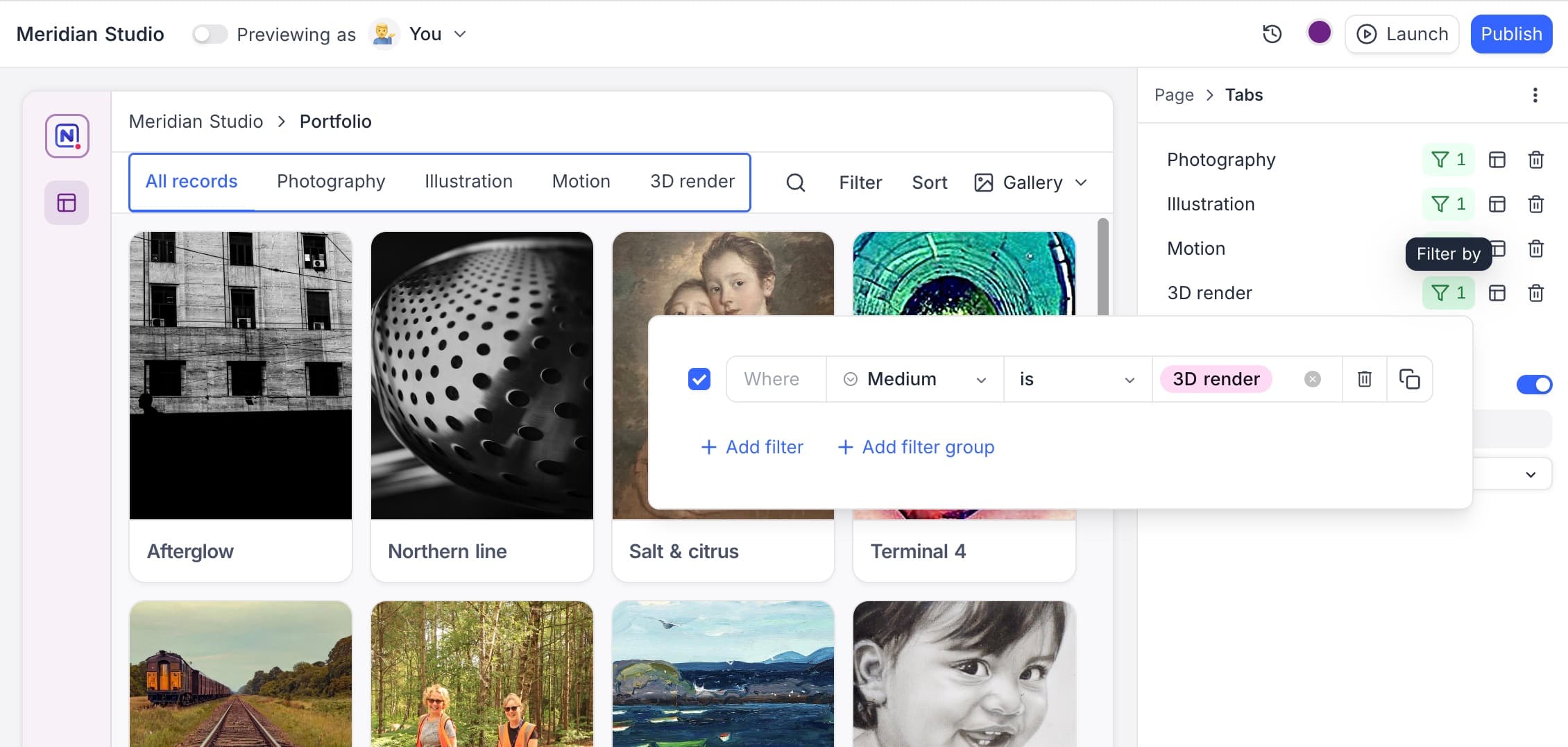
- Tabs: A row of tabs across the top of the page, each mapping to a filter condition, with an optional All records tab. On table pages, a tab can also switch the active visualization.
- Dropdown: A dropdown bound to a single-select field, with a condition (is, is not, is empty, is not empty) and an optional default value.
User filters apply on top of the filters you configure in the builder; users can only narrow the data you've chosen to show, never widen it.