Dashboard
Dashboard pages give a high-level view of your data using widgets: charts, metrics, embedded views, and more.
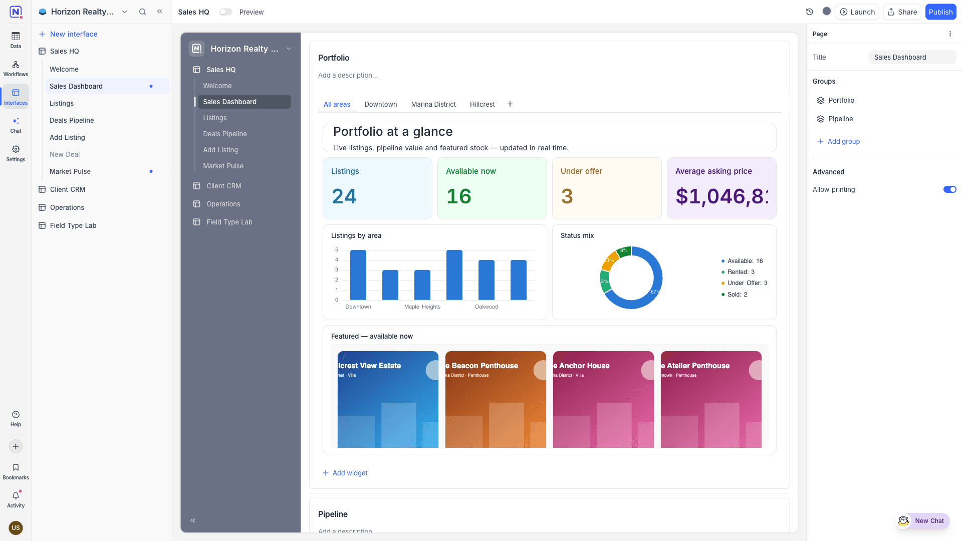
A Dashboard page presents a high-level view of your data using widgets arranged on a flexible grid. Unlike other layouts, a dashboard page doesn't bind to a single table; each widget connects to its own table or view, so one dashboard can summarise data from across the base.
Arranging widgets
While editing, drag widgets to move them and use the resize handles to change their size on the page's 12-column grid. Click a widget to configure it in the properties panel.
Widgets can be organised into groups. A group header takes a title, which wraps across lines when needed, and an optional rich-text description shown to viewers. It can also carry buttons that open a record creation form for the group's table, navigate to a page or external URL, or run an automation.
Adding widgets
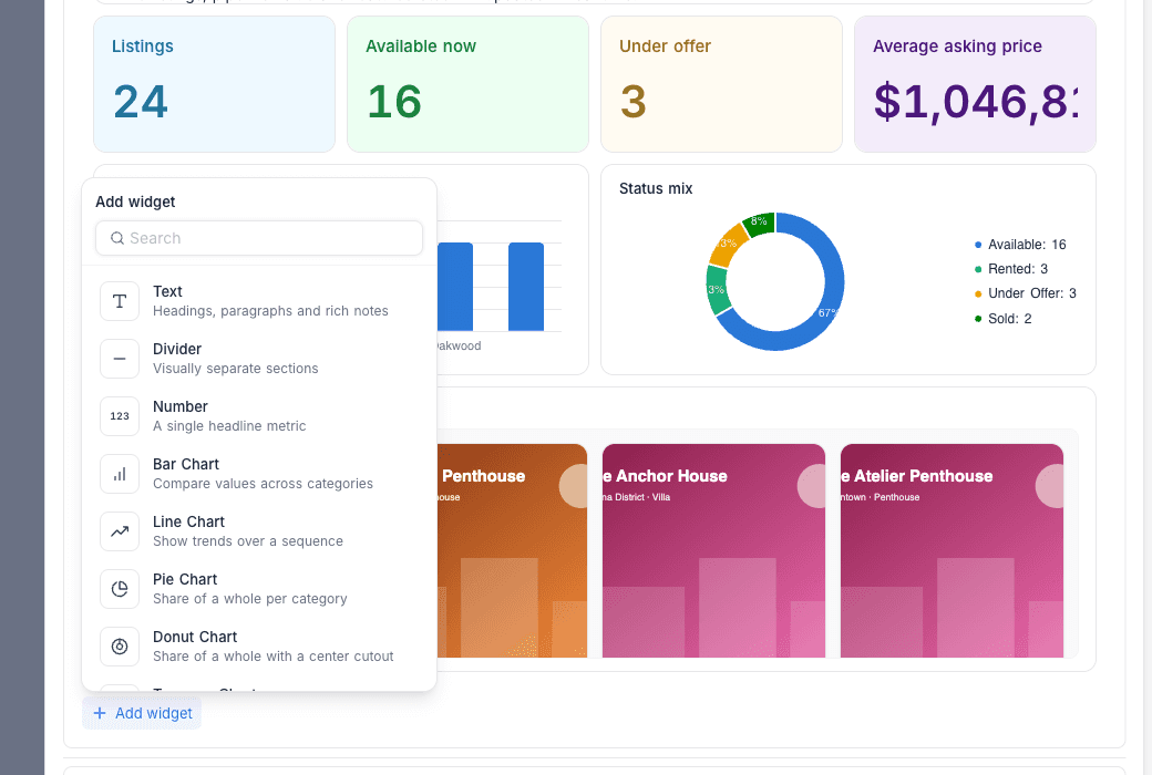
Click Add widget and pick from the palette:
| Widget | Description |
|---|---|
| Static text | Headings, paragraphs, and rich notes. Supports formatting, alignment, and callout tints. |
| Divider | Visually separate sections. |
| Number | A single headline metric: a record count or a field aggregation (sum, average, min, max). Appearance options include default, filled, and coloured themes. |
| Bar Chart | Compare values across categories. |
| Line Chart | Show trends over a sequence. |
| Pie Chart | Share of a whole per category. |
| Donut Chart | Share of a whole with a center cutout. |
| Treemap | Proportions as size-scaled tiles. |
| Scatter Plot | Correlate two numeric fields. |
| Gauge | Progress of a metric against coloured ranges. |
| Pivot | Summarise records across two fields, with rows, columns, and totals. |
| View | Embed a full visualization (Grid, Gallery, Kanban, List, Calendar, or Timeline) inside the dashboard. |
| iFrame | Embed an external page by URL. |
Configuring widgets
Data-driven widgets share a common configuration flow in the properties panel:
- Data source: Pick the table or view the widget reads from, and optionally add widget-level filters.
- Value: Choose a record count or a field aggregation (sum, average, min, max).
- Appearance: Adjust theme colours, legends, and labels.
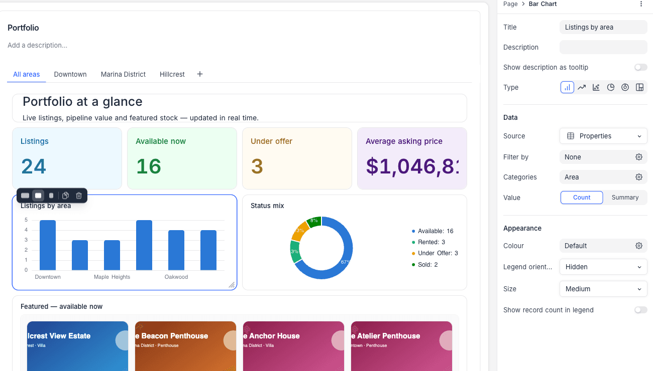
Chart data
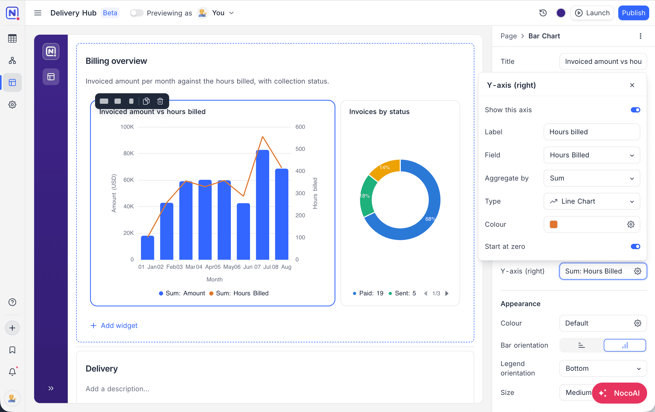
Bar, line, and scatter charts plot data on two axes:
- X-axis: the field plotted along the axis, its sort order, a category limit, whether empty values get their own category, and whether remaining categories are combined into an "Others" category. An optional legend title doubles as the axis caption.
- Y-axis (left): one or more fields, each with its own aggregation and colour. Add fields to plot multiple series on the same axis, set an axis label, and use Start at zero to anchor the axis.
- Y-axis (right): turn on Show this axis to plot one additional series against a secondary axis on the right, with its own field, aggregation, colour, Start at zero setting, and Type: Bar, Line, or Scatter. Mixing types lets, for example, a line ride over bars.
Pie, donut, and treemap charts configure Categories and a single Values entry instead: a record count or a field aggregation.
Chart appearance
- Bar orientation: render bar charts horizontally or vertically.
- Legend orientation: left, right, top, bottom, or hidden. Legends are offered when they add information: always for pie and donut charts, and for other charts once more than one series is plotted. Show record count in legend appends counts to legend entries.
- Smooth lines and Plot dots on lines: appearance toggles for line series.
- Show values on chart (bar, line, scatter, treemap) or Show percentage on chart (pie, donut): print each value directly on the plot.
- Size: Small, Medium, or Large.
The Gauge widget takes a metric plus a set of ranges, each with its own colour, minimum, maximum, and label.